
Artwork for Ariadne's Labyrinth — Ridiom EP
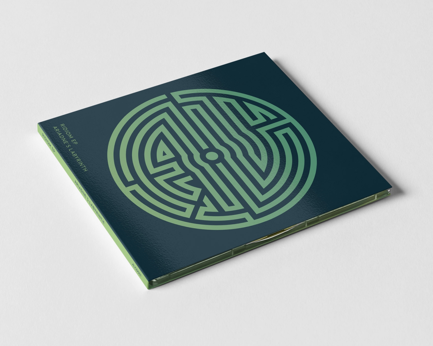
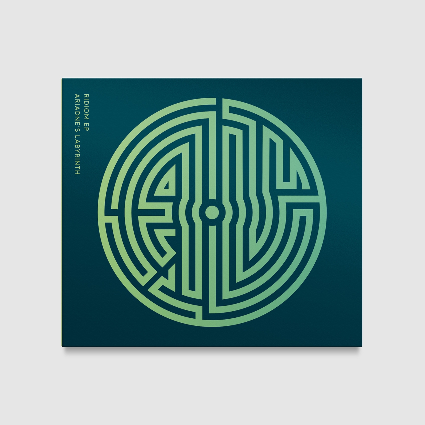


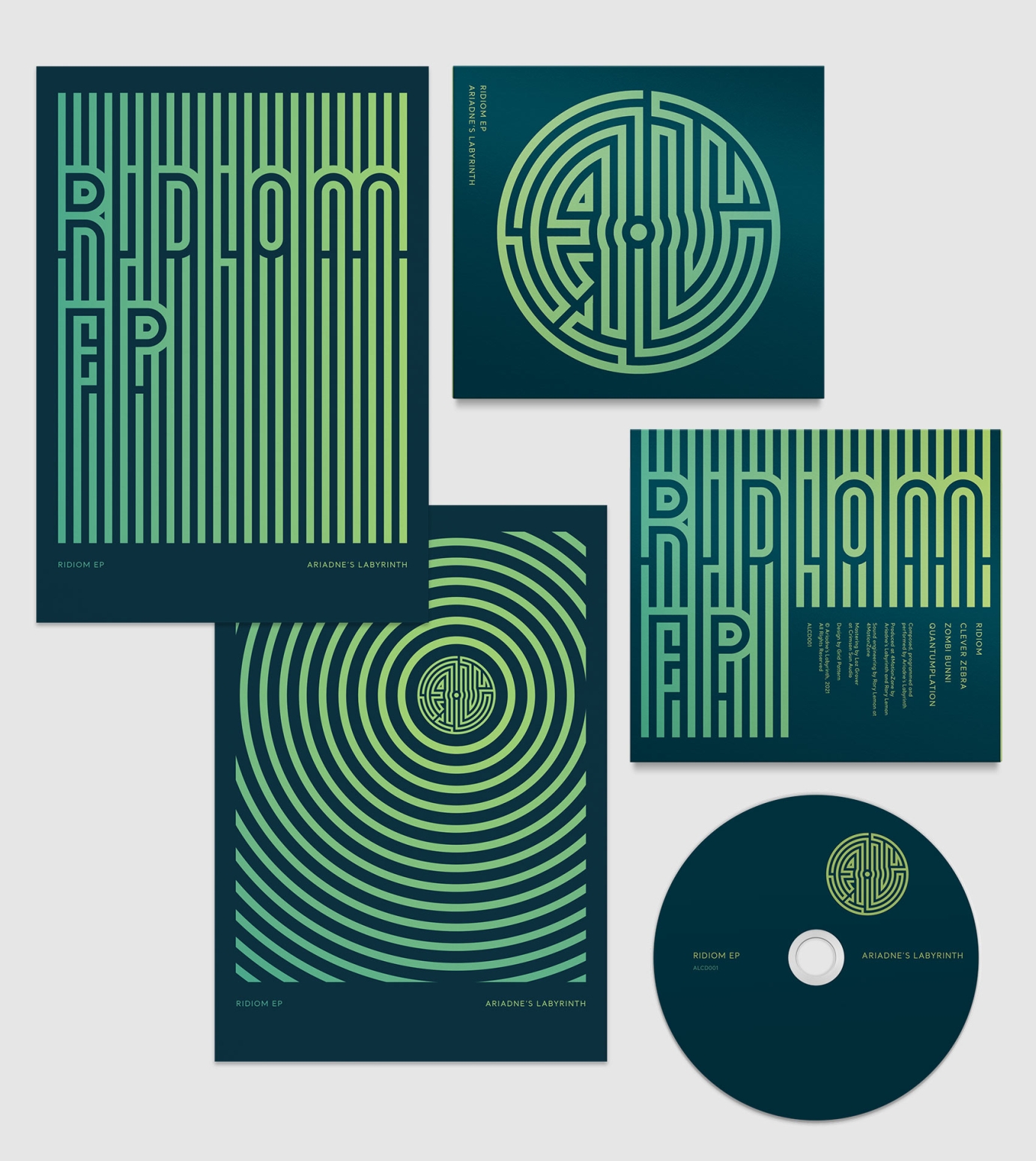
Design for a limited edition CD in gloss finish four panel digipak case.
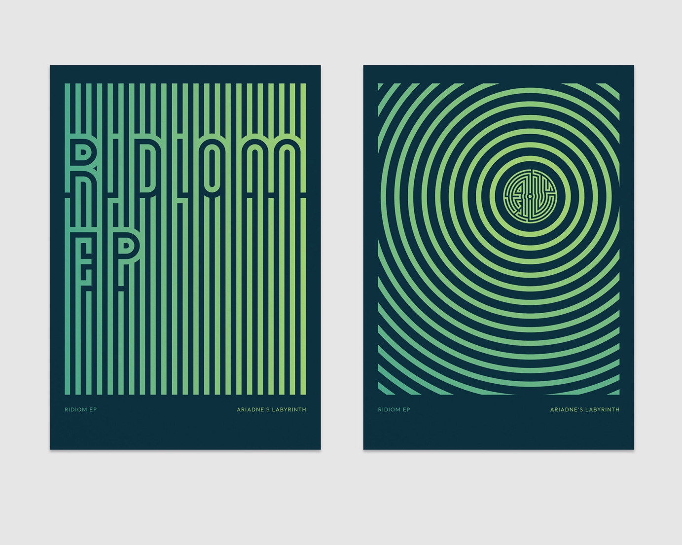
The artist was very keen to have her Ariadne's Labyrinth logo as the main element on the front, something she has done on previous releases. Up to this point all AL artwork has been black and white, so I thought this was a good time to introduce some colour. The tracks are quite frenetic with high BPMs and acidic elements mixed with beautiful melodies and violin, so the yellowy-green gradient on dark blue really suits the music to my ears and gives the release a clean and sophisticated look.
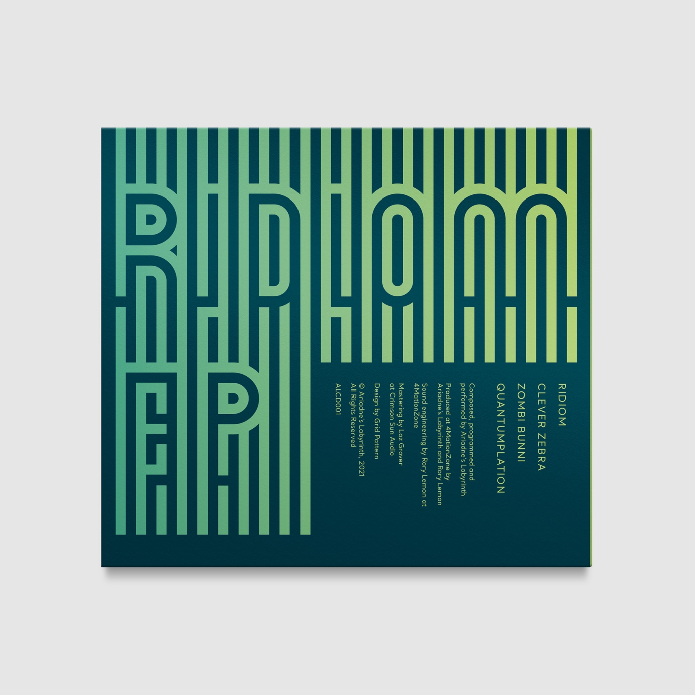
On the back I wanted to further the unique look for the EP and also try and convey the detail and intricacy of the music. My starting point was the vertical lines (inspired by the Clever Zebra track) that then evolved into the custom typography of the EP title with a few added maze/labyrinth shapes as a call back to the AL logo. The track list and credits flow with the vertical lines and tie into the orientation of the cover type.
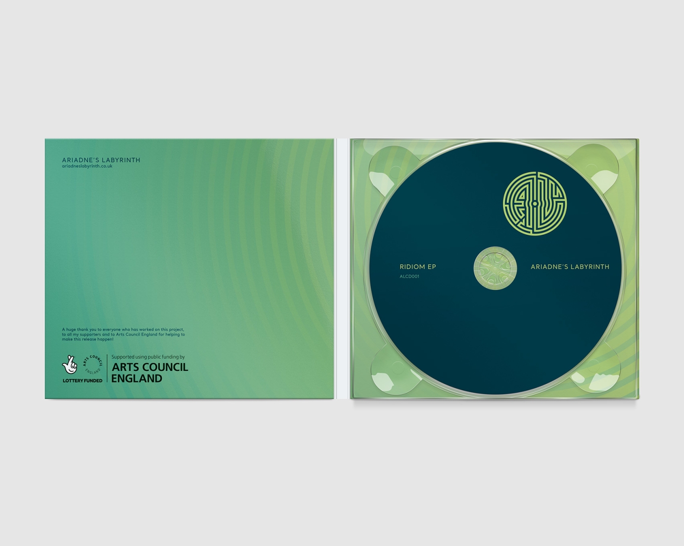
The inside flips the colours around, contrasting the outer panels and making the blue CD stand out. The lines now radiate out from the logo under the CD, conveying sound and energy.
A special bundle was also sold with two A5 single sided art cards (shown at the bottom).