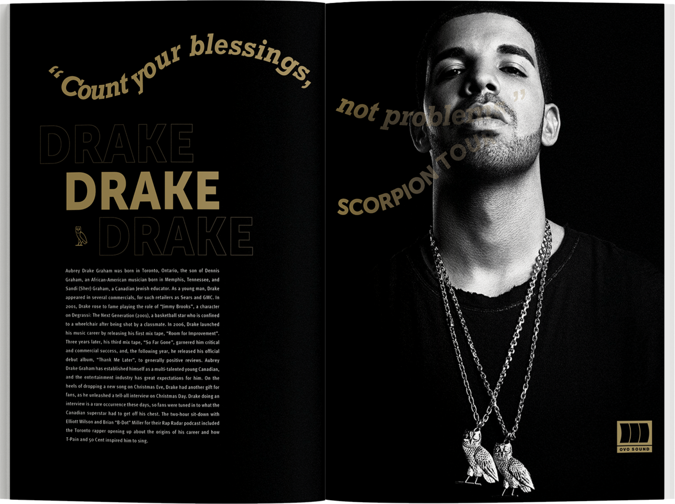
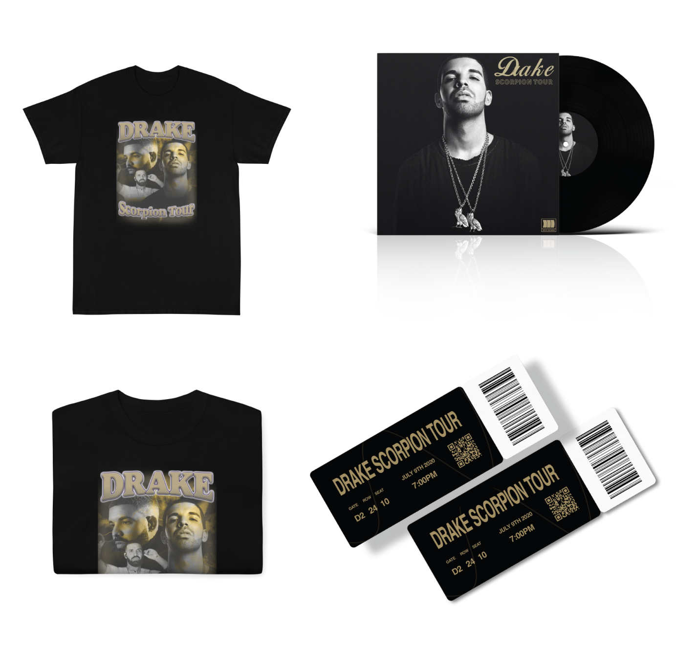
Scorpion Tour


Objective: The Music Project draws on three typographic frameworks designed to visually organize text and image. Each system has its own set of rules which can produce an infinite variety of compositions. One system uses the grid, the other defies the grid and the third addresses the use of harmonically sized letter forms. Once the typographic systems are understood students can fluidly organize words or images consider hierarchy, order of reading, legibility, balance, and contrast. The restraint of each system encourages creativity as the student explores multiple compositions. While many students focus primarily on the traditional grid system, other typographic systems allow insight into a broader range of design solutions.
Solution: The goal for this magazine spreads was to showcase the artist personality and style by incorporating the gold colours from his record label “OVO Sound” to create a unique look. I wanted the typography to represent Drake’s versatile flow. This was achieved by creating bold headlines in dynamic forms, semi circles and text that forms out his mouth like a wave of lyrics. This approach was also extended across other campaign elements like concert tickets t-shirts, album covers and billboards.